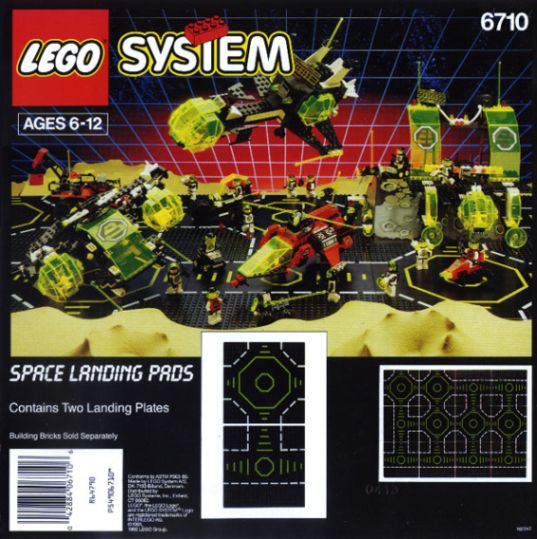
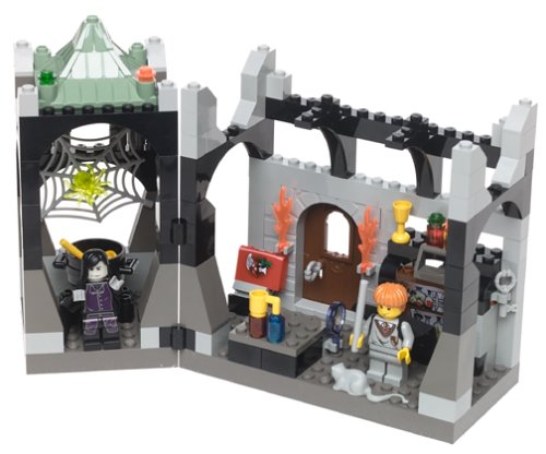
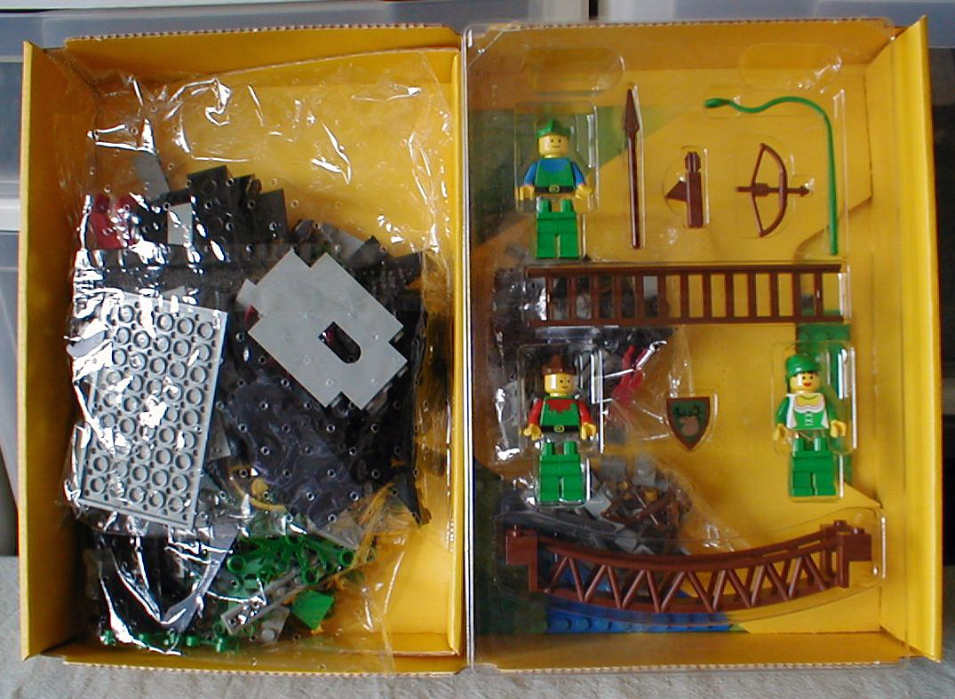
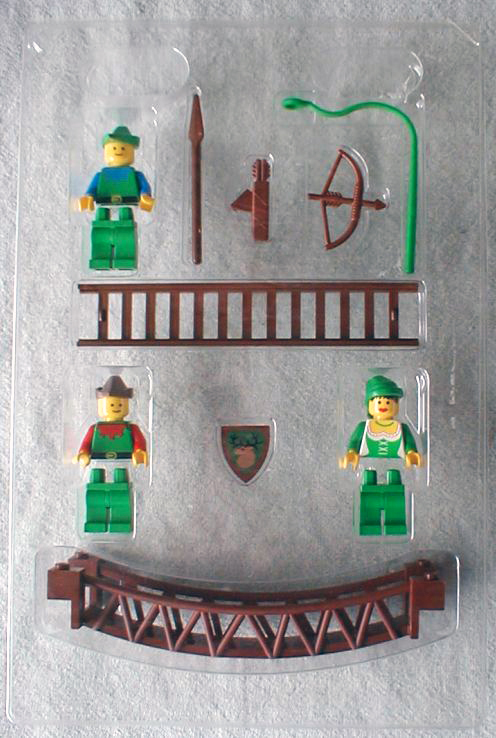
If you've browsed my site a bit you've seen that every page is a big, soppy celebration of my love for Lego.
That's not the case here.
This page is the Dark Side. This essay will leaven all that sweet, unfettered childhood adoration with the sometimes bitter disappointment of adult perspective. I know that sounds pretty unpleasant, but I hadn't had a high opinion of the Lego Company or its product for some years now, and although I had some small hopes that it MIGHT improve in the near future, I finally decided that I had to leave the hobby and find some other endeavor that would deserve my passion and inspire my creativity. What led me to this decision? Well, here goes!
Due to serious financial difficulties brought about by antiquated and expensive production systems and increasing competition from home gaming consoles, the Lego group (TLG from here onward) made a number of decisions just before and after 2000 in an attempt to reinvent itself and return to profitability.
However, my history with the product as an adult fan made most of these decisions seem like really bad ones.
If you are a hardcore defender of the faith, you might want to stop reading right now. It would very likely be a waste of your time to continue. Doing so would only compel you to e-mail me and tell me what a negative, nit-picky and uncompromising jerk I am. This may be true, but this website is mine, so I can say whatever I want. If you disagree, I don't care. I know that the words that follow will not be popular with many fans of Lego, but at least I have the respect to not smear them across every Lego website that I frequent. Instead of being a big 'ole nasty killjoy, I thought it better to keep my persnickety prose restricted to my own little dusty corner of the internet. You were warned!
I was partially inspired to compose this essay because of a post by a Lego fan that I have permanently featured on my website. I don't know where Lou Zucaro is now, but I hope that he's having fun. His words of longing for better days are so bittersweet to me now, especially in light of everything that's happened since he first published his words on Lugnet back in March of 2001. I would suggest reading his essay first. I don't want to speak for Lou, but I'll wager that he would find many commonalities in my waning enthusiasm for Lego.
I was a Classic Space fan, so my appraisal of the Lego company and its product was judged mainly from that perspective. If you think that perspective horribly skewed my viewpoint on everything that I discuss below then you need to remember that I'm just one fan with one opinion. If you don't agree, write your own essay! If I leave out sets or themes that would be no-brainers for you to address in your own words, that's because my Lego heart beats strongest for Classic Space.
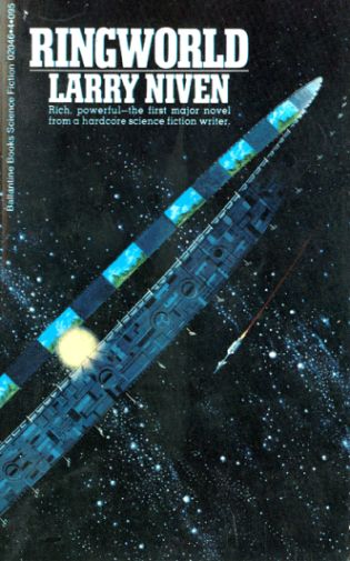
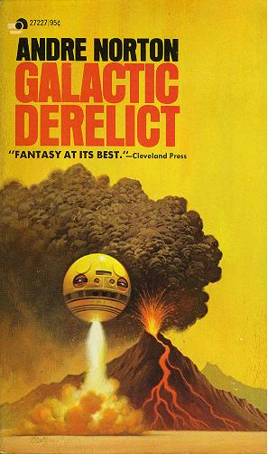
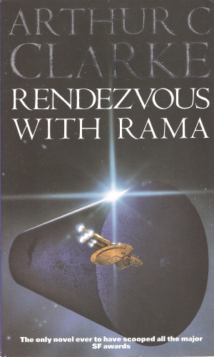
I'd been a fan of Lego since 1976. I was already a major science fiction nut due to my father's wealth of classic fifties paperbacks. "Ringworld","Galactic Derelict" and "Rendezvous with Rama" were just a few of the stories that hyper-spaced my imagination to infinity and beyond. With the explosion of "Star Wars" onto movie screens in 1977, science fiction became a hot and financially profitable genre.
I'd already had some Lego by this point and loved it, but I became a true devotee of the brick when the Classic Space line debuted just one year later in 1978. The sense of excitement and adventure that these sets inspired in me is something that I always felt every time I sat down to start a new project. I always wondered where my next creation would take me, both in terms of fantasy and creative challenge.
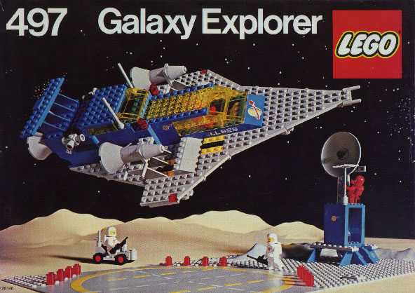
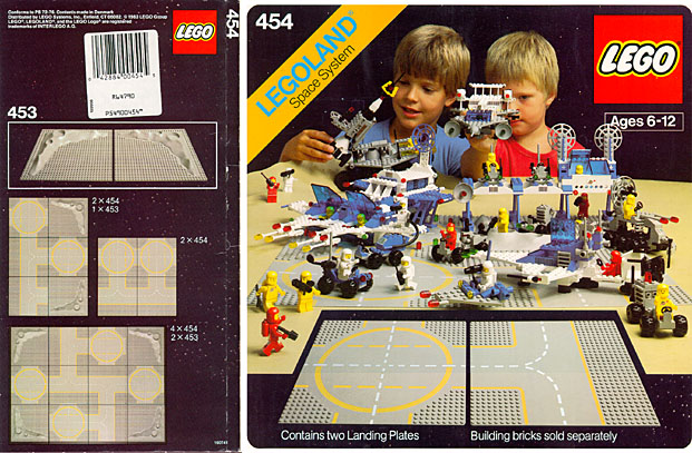
#497 Galaxy Explorer is quite possibly the greatest Lego Space set ever. As a nine year-old sci-fi fan, this set had EVERYTHING. A large and beautiful ship whose triangular lines were tantalizingly evocative of Imperial Star Destroyers, a landing pad with lights, a little base with computer consoles and a radar tower, and best of all, a little rover came out the back of the ship to explore new terrain!!
The presentation was also superlative. The simple but evocative backdrop of stars and the tan colored terrain stretched off into the horizon, inspiring an atmosphere of bold and hardy exploration set against the infinity of cold, unforgiving space.
The sets of the Classic Space theme are some of the best in the entire Lego product line. They comprise all kinds of spaceships, ground vehicles and bases, every one just brimming with play possibilities. Not only were the designs superb in their aesthetic and functions, but they were also free from conflict. There were no adversaries, no prisons, and no police. There was just the irresistible allure of adventure and discovery.
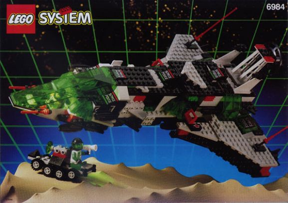
The first officially named Space theme was Futuron, and it established the idea of a cohesive color scheme and also introduced the first monorail, one of the coolest Lego Space play features EVER.
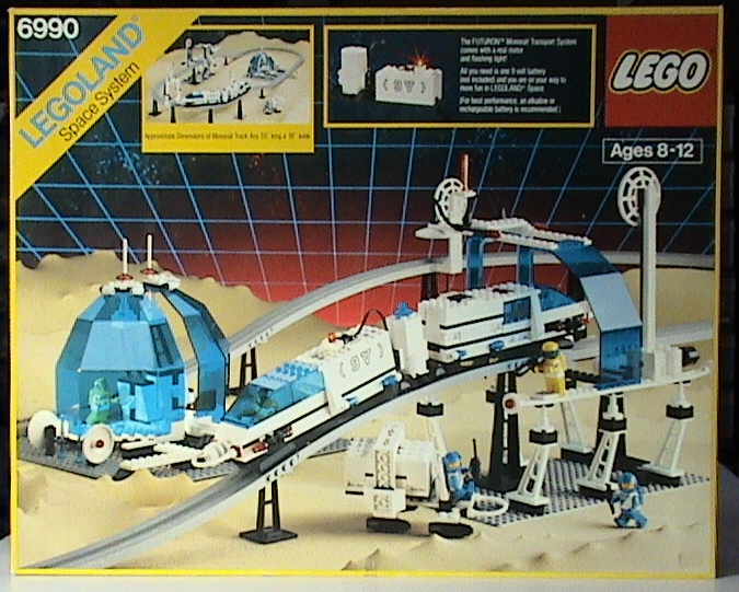
This period of time in Lego Space was hallowed to me for many reasons, however the most compelling one is, as I mentioned above, the lack of conflict. While "Star Wars" thrilled me and millions of others with its charmingly serial-inspired depictions of good versus evil, Lego Space gently yet earnestly beckoned us to explore. Seek out new life and new civilizations. Boldly build what no one had built before. Imagine.
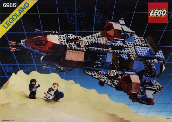
To this day, that is the single most powerful bolt of nostalgia that hits me every time I see a canary yellow box with the "LEGOLAND" banner at the top right corner. No fighting, no punishment, no evil. There was only the next frontier and the wonders and mysteries that lay in wait beyond the second star to the right.
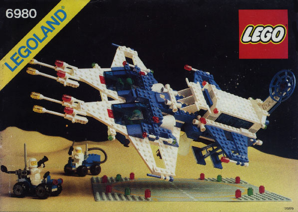
Of course, conflict would arrive soon in the form of later themes which were pitched against each other, such as Blacktron I and Space Police I, and Blacktron II and Space Police II.
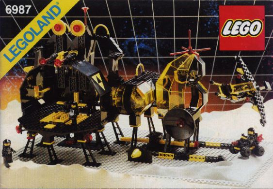
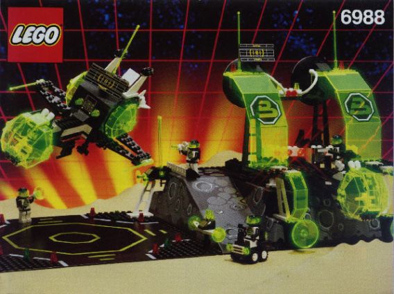
I didn't really have a problem with having good guys and bad guys in the Space Lego universe, but I started to worry when that type of interaction became the focus of the entire theme and all the ones that follow. I feel that this design choice created a number of problems.
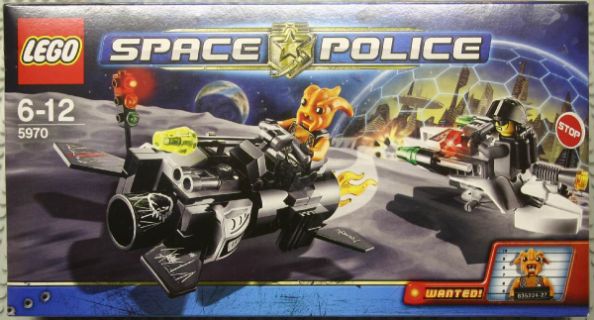
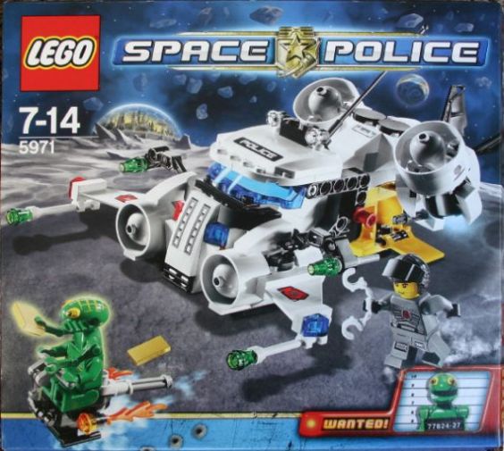
I'm just using these sets as an example. The Space Police III theme was pretty darned good overall, but I think that they could have been even better if almost all the sets hadn't been required to be a crime-in-progress. The effect is of this was two-fold:
First, you have the diminished piece count and detail necessary for those sets containing two vehicles. While each Space Police I and II set had a prisoner, that prisoner didn't have a separate vehicle. This meant that parts that would add detail and flesh out the main ship wouldn't have to be sacrificed to include enough pieces for the second, smaller bad guy ship.
If the bad space robbers had their own theme of sets, then the piece count in many of the Space Police III sets wouldn't have to spread too thinly across two vehicles.
Being more overt about defining the parameters of the action restricts the play possibilities. I think that the "script" for the sets should be as open as possible. I question the more overt and specific nature of the criminal activity in particular.
Exactly what Blacktron I and Blacktron II mini-figs were up to was never made clear, so the child was left to imagine their own stories. It was with the advent of more recent sets from most Lego themes that the bad guys specifically became bank robbers or insane cyborg scientists/inventors who want to rule the world.
I understand that this paradigm is easy for little kids to grasp (and frankly I think that the Agents theme is a great idea, very well implented), but shouldn't we also continue to remind kids to be inspired by a sense of curiosity about the world (and the universe) instead of just focusing on the strict application of law? Thankfully, the themes that followed Blacktron and Space Police like Mtron, Ice Planet 2002, Unitron and even Exploriens kept this basic principle alive, because really, does it make any sense to have the entire Lego Space universe solely inhabited by criminal scum?!
That's an awfully narrow and dogmatic view, isn't it? Where are all the happy, well-adjusted Space citizens? What great discoveries are intrepid explorers and scientists making while the new Space Police III officers spend all their time running down extraterrestrial bad guys? I don't want to veer off into too long of an analytical tangent here, but do ALL the bad guys have to be aliens? I know, I know, I'm probably REALLY nitpicking, but should Lego sets advocate a behavioral model that's more than a little xenophobic?
ANYWAY, my main point is that Lego has repeatedly stated that they've always had a very strong policy about NOT making modern guns and vehicles of war. However, the strict dichotomy of good versus evil and the never-ending conflict of that paradigm are a MAJOR component to many modern Lego themes. They're not using 9mm pistols or Sidewinder missles, but I don't think that it's too much of a stretch to suggest that more and more Lego themes are depicting an increasingly "us vs. them" scenario.
To quote Dr. Zoidberg; "Why always the fighting?

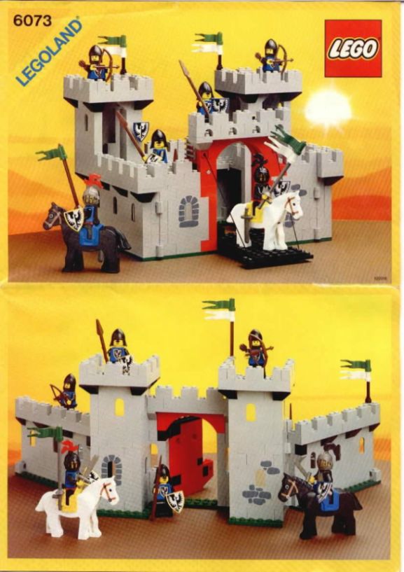
I digress! Back to the beginning! The Castle sets from the early days, like the Space lines, were also superb. They featured intricate and detailed exteriors and interiors, and modular design so that multiple sets could be connected. The backs of the boxes and even the instruction sheets suggested ways to rebuild the sets into other structures!
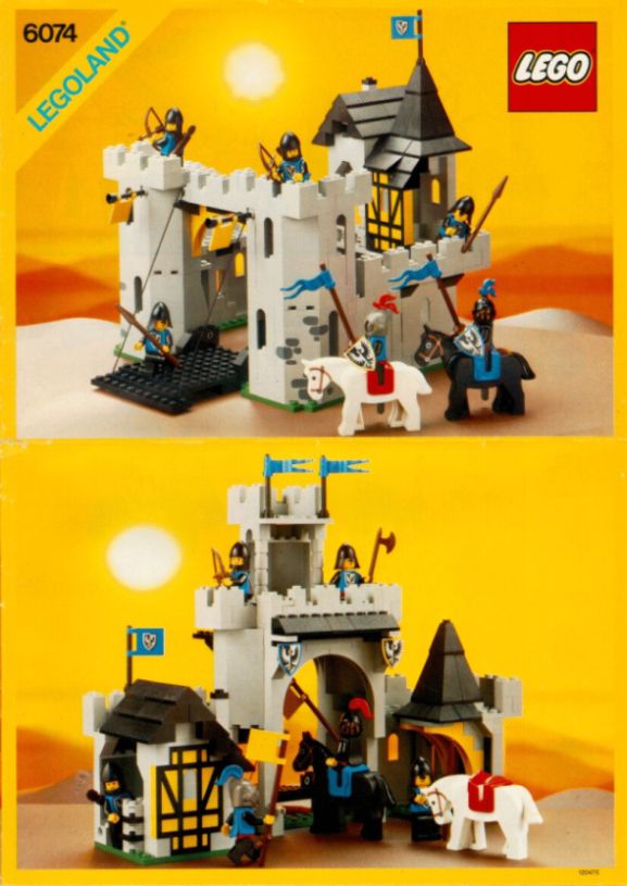
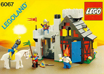
There were even a few civilian buildings such as the famous #6067 Guarded Inn and #6040 Blacksmith Shop.
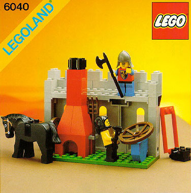
These sets helped to create an atmosphere of everyday life in addition to the heroic knight's adventures that other sets always had in abundance, and for almost three decades, Lego sets represented the best that construction toys had to offer; superior product quality, excellent packaging & presentation and most importantly, sets that captured the imagination of young and old worldwide.

However, as the 90's drew to a close, things started to change. Several things culminated that put TLG in dire financial straits.
Home gaming consoles were gobbling up all the profits (and all the kids' free time) and TLG's attempts to garner new fans fell flat.
The Galidor TV show and subsequent action figure line was a massive failure, and TLG had yet to venture into licensing so their awareness with their target market was shrinking along with their shelf space in toy stores.
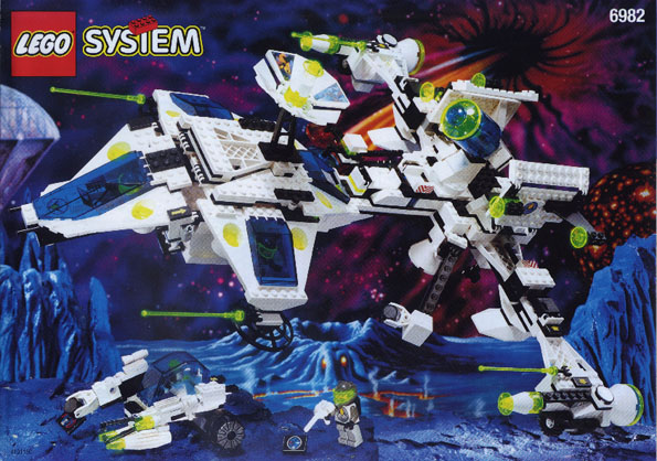
- At the same time, many themes began to suffer from poor set designs. In the Space line, the Exploriens theme was an excellent example, as the main ship looks like they dipped a long rod in super glue and just thrashed it around in a bin of parts.
Compared to earlier sets which always felt sturdy, cohesive and well thought out, this one seemed like it had been tossed together in a day. It had no solid bones and no strong overall shape.
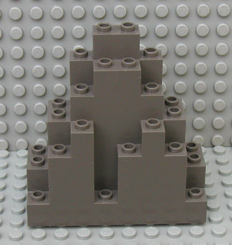
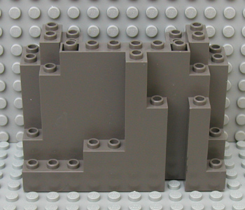
The Castle theme also suffered as well from the advent of the BURP (Big Ugly Rock Piece as it came to be known) which was used widely as a substitute for bricks.
It has since become somewhat of a beloved, red-headed stepchild, let loose from its cage if a giant hill needs to built quickly. It won't look too pretty, but you can make it fast. This need for building speed was also expressed in other parts such as the 1x5x5 Castle wall piece.

This piece was also used heavily, further decreasing the number of bricks and plates in each set. Its aesthetic value was limited as well, since it only looked good from the front. Seen from the back you can tell how thin it is compared to any bricks next to it.
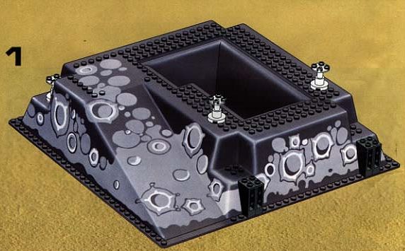
Baseplates began to grow hills so that buildings could seem taller, but they didn't really have much use outside of providing the finished set with a pre-formed booster seat. I wouldn't have had such an issue with this if I hadn't feel that the vast majority of sets were given these baseplates as an easy way to make the set look a LOT bigger than it actually was. It also seemed like a lot of bricks were sacrificed from the overall model for the baseplate to be present.
Solid walls began to disappear from sets across all themes, and buildings began to resemble wire frames with a few decorations tacked on here and there.
#6566 Bank is an excellent example:
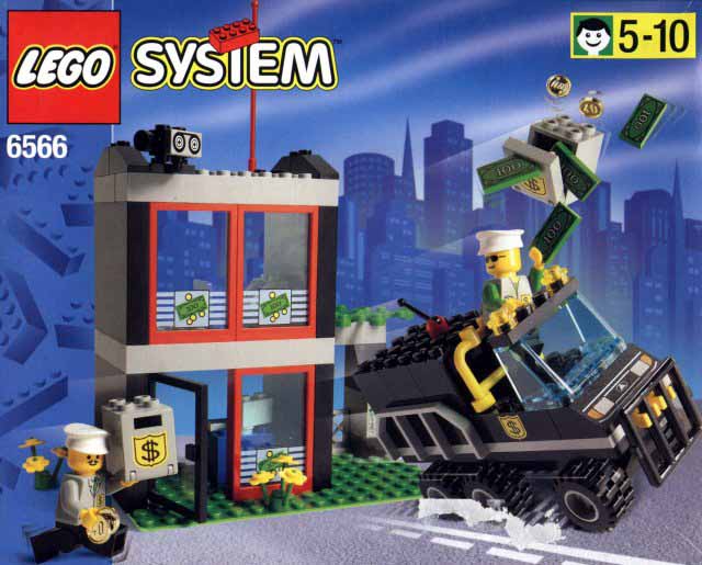
Both the building and the van have been reduced to simple boxes with hardly any attempt at structural realism.
Castles began to look less realistic and more toy-like, which, IMHO, decreased their grandeur.
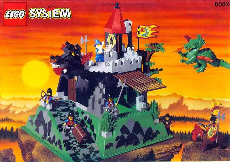
#6082 Dark Dragon's Den has it all, a CRAPP (Crummy Ramp And Pit Plate, as many AFOL's refer to it), BURPs and almost no structural cohesion. It's essentially an empty shell with a lot of moving parts stuck in random places.
Around the same time, a new line was introduced called Town Junior, and all the sets from this theme displayed a marked decrease in the number of parts. Not only were there fewer parts, but the ones that remained were large, pre-molded pieces that led to a new AFOL term; "Juniorization." This term was used to describe any set that contained such parts that clearly were meant to substitute for basic bricks that could have achieved the exact same building need.
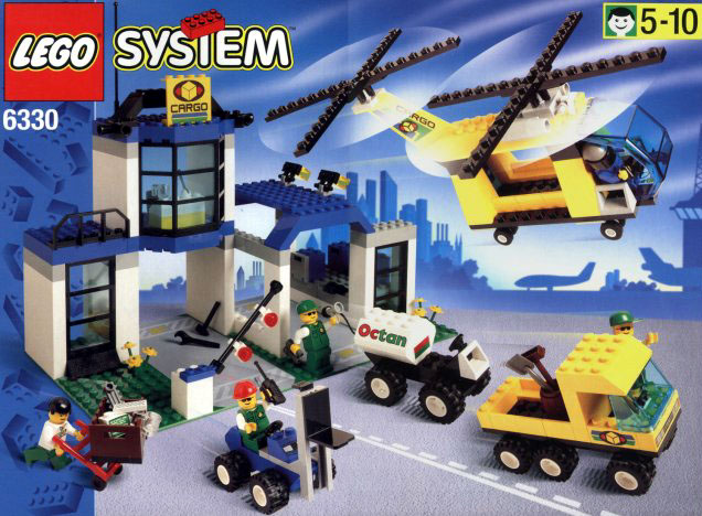
#6330 Cargo Center epitomizes this trend. The building, much like the #6082 Dark Dragon's Den, is a quick cobbling of simple bricks and plates into empty shells with no architectural details. The vehicles are just as featureless, having no brick-built mudguards or other previous attempts at realism. I find the little wheels on the helicopter particularly laughable. The boxy shape of the vehicle overwhelms the teeny wheels, making them look as if someone tacked some Hot Wheels tires onto a skateboard!
These sets also contain a part very representative of "Juniorization"; the 1xnx5 super-tall brick, a slightly less ugly kin to the BURP and a part which spread like a virus through every set to come off the line, even those that were not part of the Town Junior theme.
These are parts solely designed to take the place of five vertically stacked bricks, not only diminishing the number of bricks in the set but also reducing the alternative building possibilities.
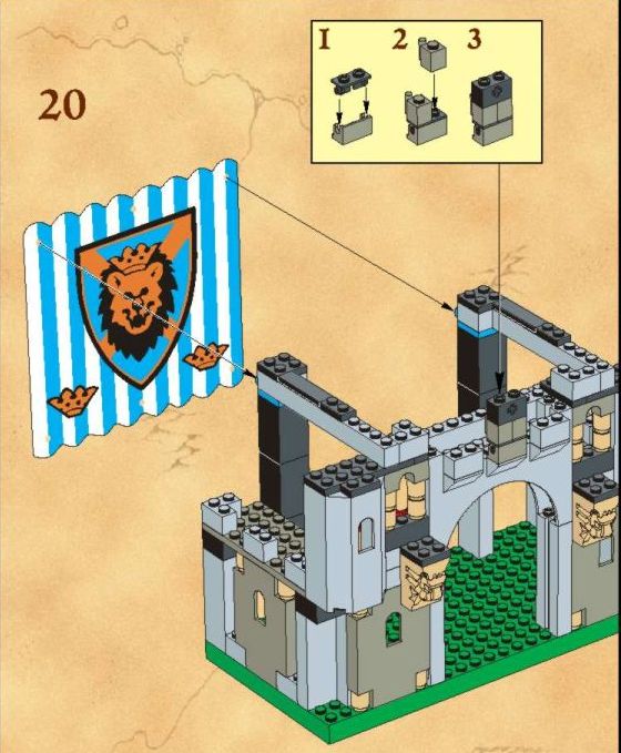
An even more ridiculous of example of brick substitution can be found in #6098 King Leo' Castle. This set not only packed with the above parts, but the back wall of the castle is a friggin' cloth banner!! The Bull faction isn't gonna have any problem storming this paper palace!
Many sets began to show what I can only interpret as TLG's decision to initiate a core change to the way sets were designed and used. Instead of carefully building the set, playing with it and then rebuilding it into something else, the focus shifted to a quick and easy modular build with no emphasis on reconstruction. Build the toy, play with the toy but don't bother taking it apart and doing other stuff.
While it's true that the Designer and Creator lines have kept this flame alive, I believe that the idea of creative rebuilding should be a key element in EVERY Lego set.

The introduction of the Jack Stone theme also occurred, which was intended to provide a bridge between Duplo and System sets. These sets again demonstrated the turn away from rebuilding as they were extremely simple and consisted of very few and yet very large specialized parts that were quite unsuited for any uses outside of what they were created for.
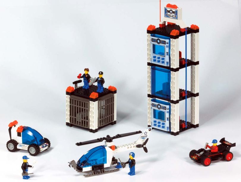
I understand that these sets were intended for younger builders, but I don't think that precludes them from offering a few building challenges beyond making the entire set inside of a few minutes.
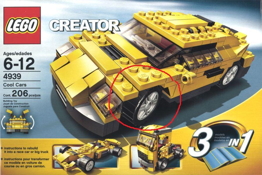
When some of these parts began showing up in System sets, it almost seemed as if TLG had lost confidence in their target market's ability to construct complex objects. Entire car chassis, once made of multiple parts, now came as one, large pre-molded piece whose usage was extremely limited.
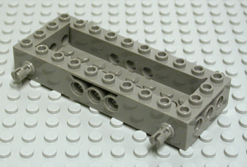
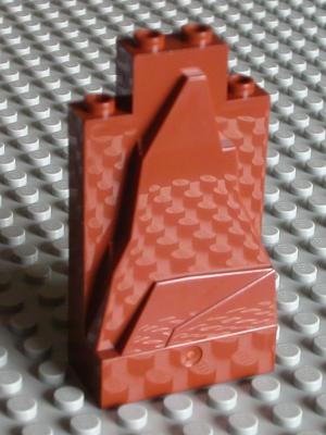
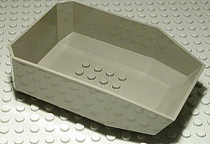
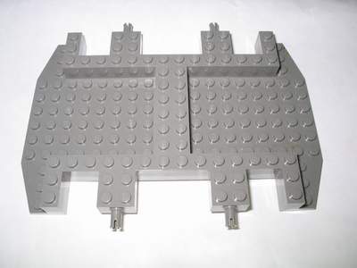
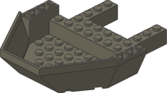
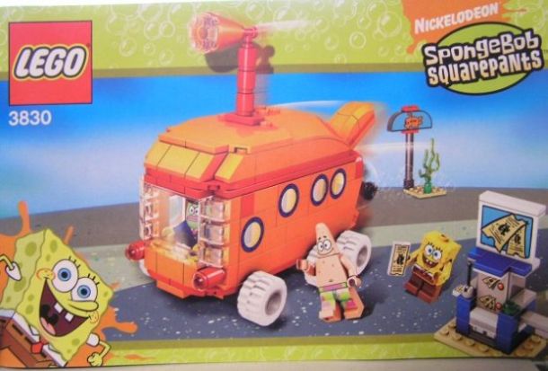
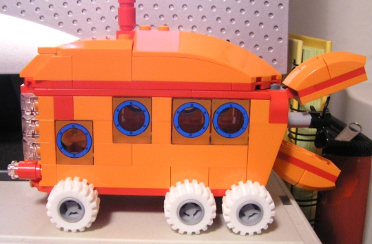
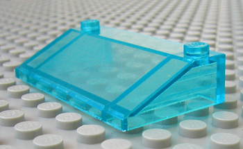
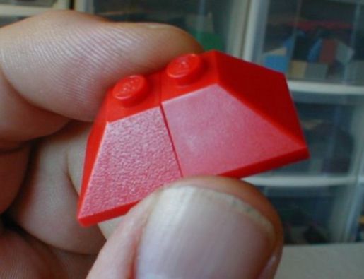
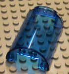
Rock Raiders took this pre-fab idea further with even larger and more useless parts such as these:
This was the first of many changes that seemed to achieve no other purpose than to reduce the building challenge.
However, the worst was yet to come.

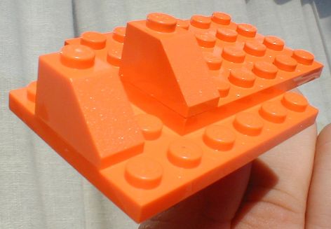
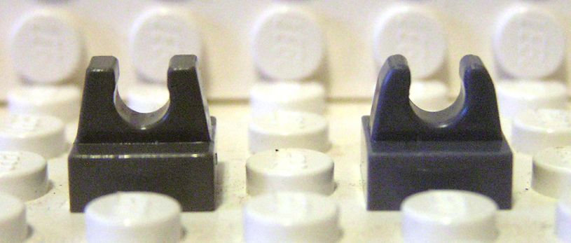
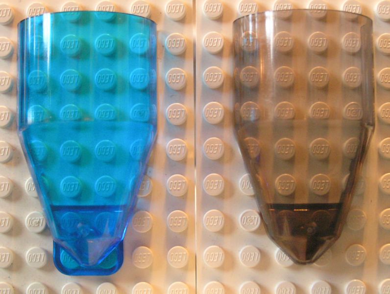
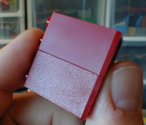
Sometime near the end of 2003, TLG initiated a plan to overhaul the brick color spectrum, resulting in a decision to "tweak" the colors of gray, dark gray and brown. The new grays have a distinct bluish tinge, while the new brown presents a strong reddish cast.
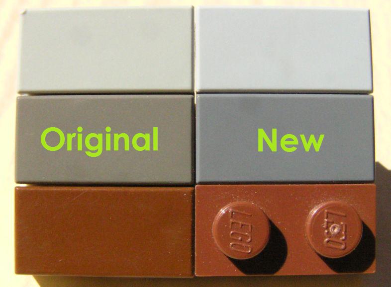
There was no announcement of any kind. No consumer poll was taken. No AFOL opinions solicited. All of a sudden you opened a brand new set in early 2004 to be confronted by colors (all three of which had been in production for decades) that no longer matched the ones you'd spent years (and probably quite a bit of money) amassing.
On a trip to Legoland California in May of 2004 I discovered at the Pick-A-Brick store that the original colors were now considered "retired." It was a massive shock for many, myself included, and I was left wondering:
WHY?!
Jake McKee (an AFOL himself), who was then working for the Lego Company as a liason to the adult fan community, had the unenviable task of explaining the situation to adult fans on Lugnet and other websites. The following is an excerpt from his first official post on Lugnet addressing the highly controversial subject:
"The Design Lab is an internal group at the LEGO Company who is responsible for overseeing the �system� aspects of everything the LEGO Company does. They�re the ones that maintain the element library, element history, �own� the element design process (working with others in the company), own and guide the growth of the element library (ensuring the element selection doesn�t get out of control like the late 90s), own the color palette, and many other tasks. Basically, they work to ensure that the system works long term, and is the most robust, consumer (kids and adults) friendly it can possibly be.
Around the beginning of 2000, we found ourselves with a color palette that was growing far too quickly, and far too organically. There wasn�t enough vision put into how we were expanding and adding new colors. The decision was made to apply the same type of thinking we now use in approaching the long term element design process to the color palette. The desired outcome was to create a color palette that would work effectively for years to come, and that could scale easily and correctly. We didn�t want to end up with the same out-of-control color situation as we did with elements in the late 90s � that was a hard lesson to learn, but we learned it well.
This initiative led to a revised color palette. This new color palette included some deletions of low-use colors, additions of new colors, and some tweaks to the existing colors. The goal in all these changes was completely and totally focused on creating the absolute best set of LEGO colors possible.
There has been a great deal of assumptions posted about the reasons we made the changes. Everything from trying to copy MEGABloks, to trying to save money on recycling parts. I know it seems hard to believe (unless you really think about the long-term history and attitude of this company), but it really is as simple as trying to create a sustainable and consistent color palette for the future.
As one part of the process of defining this new, long-term color palette, we tested the new color palette with children in the US and Germany. I won�t get into the details of how we actually tested, as I don�t have those details. But suffice to say, the tests came back overwhelmingly positive."
It's true that the Lego color pallete was out of control. WAY too many rarely used colors were being produced, making them fairly useless in building because of the very limited parts selections. It made perfect sense to delete most of these colors since it would significantly reduce costs. Additionally, the recent introduction of more dark versions of colors has created a palette that provides much more sensible and exciting aesthetic choices than ever before.
However, the grays and brown didn't need to be "tweaked." They worked great as they were.
IMHO, gray is not supposed to "pop." Gray should be gray, not bluish gray. The same goes for brown. Brown should be brown, not reddish brown. The "core" colors should represent the exact middle of the spectrum for that color, and the new grays and brown do not do that. Furthermore, no details are provided to answer the crucial question of why? Why were the colors "tweaked?" What the heck does "scaling easily and correctly" even mean? I'm guessing it's a term color theorists use, but they're not the ones buying the product.
It wasn't broke, so why "fix" it?!
Also, the explanation that the tests on the new colors "came back overwhelmingly positive" has no argumentative value whatsoever. OF COURSE the kids are gonna be happy!! However, the reason they are happy is because you gave them some free brick to play with! The children's positive response has almost nothing to do with the color of the bricks!
Why?
When children build (and I'm referring here to TLG's target market of five to twelve year-olds), they hardly ever show any kind of color preference. If you look in the Lego magazine that TLG releases every month, there are always a few pages where kids are pictured alongside the models that they've built. In issue after issue, year after year, 99% of these models are rainbow warriors. Rarely does any child show an inclination to maintain some kind of color aesthetic in his/her creation. The photographs very clearly show that kids don't care about what color the bricks are, they just care that they have some with which to build. I've been to LOTS of Lego club meetings over the years and can attest to seeing this theory "in the brick" every time a child's MOC comes to my attention.
As Jake's post continues, we learn that TLG was aware of this (and was counting it), but we also see how the color change could have been avoided:
"A planned roll-out plan of these new colors was planned and implemented for all products produced starting January 2004. The thinking was that it was much better to simply make a quick switch to the new colors, assuming (correctly, from what little we�ve heard from non-AFOL sources; incorrectly from what we�ve heard from the AFOLs) that the change would go fairly unnoticed. Changes are made regularly to the bricks, to make them better in some way. Improved clutching power, easier part separation, and many other things I don�t begin to claim to understand are regularly tweaked to help improve the elements. With the LEGO Company�s desire to keep their decades-long reputation for quality, we�re constantly working to improve things that almost all the time, consumers won�t even notice. I know a statement like this will open a can of worms. The point I�m making is just that we are constantly improving little small things trying to make the overall system even better.
Of course, one thing that Design Lab was unaware of at the time of implementation was the incredible impact on the AFOLs. It�s hard to remember, but when this �color palette cleanup� process was first initiated, LEGO Direct was one person � Brad Justus. The LEGO Community Development team was more than 3 years away from being formed. My role was both the Community Liaison (30%) and Web Producer (90%) � an amount that adds up to more than 100%!"
The last paragraph in particular provides the answer. The Lego company had only recently begun to have any kind of interaction with the adult fan base, and their lack of dialogue with us and knowledge about our specific interests and concerns, which are quite different from kids, resulted in their complete ignorance of how the color change would affect us.
Having only !one! person to be the liason to a fan base in the number of (I'm guessing here!) tens of thousands is NOT a real strong demonstration of sensible and effective business policy towards that particular group, especially when those fans are among the most vocal and passionate advocates of the product! At the time, it was easy to conclude that TLG didn't know much about AFOLs and even worse, didn't care enough to try.
I recall another post, possibly from Jake as well, where he described taking a small contingent of Lego company executives to an AFOL convention, and they were blown away by the creativity and complexity of the displays present. However, the real surprise came from the revelation that most of them didn't even know that these conventions took place!
If TLG had been a more open company and displayed more interest in interacting with ALL of its fans, it's extremely likely that the color change would never have occurred, and that just broke my heart. If they hadn't maintained such a distance from their most devoted consumers, then they would have been able to avoid making a decision that has created such long term negative effects.
For me, the primary one is the fact that the backwards compatability of the product has been permanently damaged. From my adult perspective, the fact that I could combine Lego parts from different decades in a single creation and have them come together beautifully both in fit and aesthetic was one of the single most appreciated aspects of the product. Now that's gone.
I was faced with several options, none of which had any appeal:
- Incorporate the new colors, with the additional onerous task of having to constantly differentiate and sort two very slightly different colors, while at the same time watching the number of parts in the "retired" colors shrink as their variety and availability is now finite.
- Sell off all my "retired" colors, which would be an extraordinarily time-consuming and ultimately impossible solution given the size of my collection (and my nostalgia for the original grays due to my love of Classic Space).
- Reject incorporating the new colors, which means that I'd have the additional task of sorting out and selling off any parts in those colors in new sets that I purchase.
- Never buy a new set again, and only purchase new and used bricks through third party websites like Bricklink.
- Abandon the Lego hobby altogether.
For awhile, I was going back and forth between the third and fourth options, but recent developments persuaded me to finally choose the fifth (more on that later).
I used to look forward to new product with great relish, checking out the design, play features, overall "coolness" and having all kinds of ideas for how to use the new parts that appeared. However, I just can't accept the bleys because I can't build Classic-themed MOC's without Classic colors! However, there were some very creative uses of both tones of colors.
For example, the two different browns can be combined to give the appearance of different grains of wood in a train car such as this one:
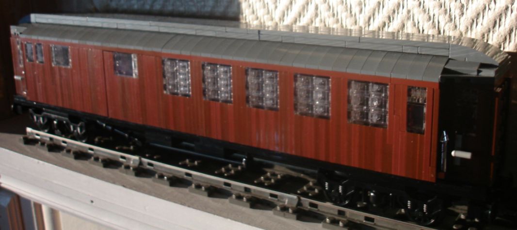
However, this type of application, while fantastic aesthetically, is limited to the three colors that have been discontinued, and again the options will continue to shrink as more new parts are made only in the new colors.
I really tried to adjust the color change for awhile, but eventually I just couldn't keep faking my enthusiasm.

Just before the color change occurred, TLG began a huge dive into licensing. Initially, I was totally stoked about the Star Wars Lego sets. It was a childhood dream come true to buy an official Lego X-Wing or Millennium Falcon. Seeing all my favorite characters in mini-fig form was a blast, and I loved how we got so many different versions of each character from all the films. I bought LOTS of sets and loved them all.
However, when the color change came along just a few years later, I couldn't justify paying full price for sets that were almost totally comprised of the new colors. The UCS Millennium Falcon was an amazingly awesome set, but I just couldn't see the point of purchasing it. Since I didn't want the new colors in my collection the model would have always been a show piece, and I wanted to play with ALL my bricks!
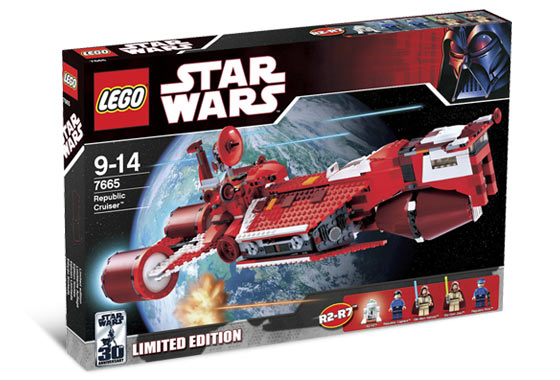
In addition to the color change affecting my buying decisions on Star Wars sets, TLG also began to market "limited edition" sets and mini-figs, only available through certain stores, online or through mail-in contests. For example:
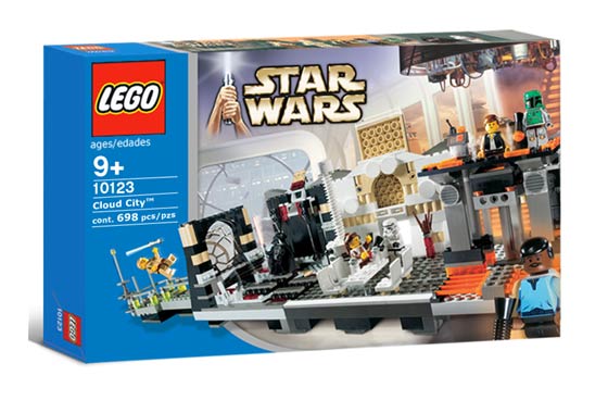
I believe that The Republic Cruiser was only available at one retail chain (Toys R Us?), while Cloud City was a Shop at Home exclusive. The result of this exclusivity? The Republic Cruiser (from 2007 at $90) now fetches 130 to 360 dollars. Cloud City (from 2004 at $100) now ranges from 550 to 792 dollars!!
I really disliked this attempt to appeal to the manic Star Wars collectors who have to have one of everything. One of the things I loved about Lego was that the obsessive collector mentality wasn't a strong presence in the hobby. There wasn't a secondhand market of insanely priced special parts and no one was trying to get every single Lego piece ever made. People bought what they liked and/or what they needed to finish certain projects and that was that.
It's always been true that some parts are rarer than others, but they weren't valued and traded with the rabid ferocity of special comic book covers or action figure variants. There were parts that had appeared in only one set, but they weren't purposefully manufactured that way. I felt that these "limited editions" detracted from the point of the product, which is open-ended creative play, not the greedy, grasping "Gotta Catch 'Em All" mentality of Pokemon. That sickened me. Lego was meant to be used and enjoyed, not coveted and hidden away in a closet. The mini-figures in particular have achieved an almost fetishistic status.
For example, here are two Star Wars mini-figs that were designed and released solely for the purpose of inciting sweaty-toothed fanboy slavering:
The gold chrome C-3PO mini-fig, which was randomly inserted into Star Wars sets during 2007, and the chrome black Darth Vader mini-fig, which was randomly inserted into Star Wars sets in 2009.
People were actually bringing scales with them to the toy stores so that they could spot the difference in weight between boxes! The prices for these figures are insane. The gold chrome C-3PO is now priced from $100 to $372!! The chrome black Darth Vader ranges from $32 to $76. So, an item which cost you nothing (since you got a set along with it) is now worth many times more than your initial purchase.
To further stoke the blazing flames of collector fever, there was even a mail-in contest in 2007 to win an actual SOLID GOLD C-3PO mini-fig! What possible use could any builder have for a mini-fig with an initial value over $1,200?! All you're likely to do is put it on a shelf in a glass case and covet it like Gollum gibbering over the Ring!
Of course, the more sensible thing to do would be to sell it and buy some Lego that you can actually build with! Again, I have to say that I DESPISE purposefully manufactured rarities. The item ceases to become a toy and instead becomes an object of fervent, sweaty adoration. I love my toys, but I'm not going to worship them, nor do I wist to invest in them. I am invested in the hobby, but that's an emotional connection, NOT a financial one.
The effect of all this pandering to collector mania is twofold. First, as I have shown above, it greatly inflates the prices of many sets and mini-figs, especially after they were no longer in production. Secondly, many hoarders (*ahem*) "investors" are buying multiples of every set and then putting them into storage, hoping to sell them later and make a killing. Not only does this defeat the purpose of the toy as it will likely never be opened and enjoyed ("I won't go back into storage!"), but it removes a LOT of useful pieces from the aftermarket or inflates their value WAY beyond reason.
A perfect example, again from the Cloud City set is the three-stemmed flower part in brown (#3741).

This part had never appeared in this color before, and it could be a superb detail piece to suggest dead patches of grass in a field or many other things. However, because of the Star Wars label on the box and the exclusivity of the sets availability to Shop at Home, a small part which would likely be priced around fifteen cents now goes for more than a dollar.

Around the same time that the Star Wars license began, the click-hinge invasion also commenced. At first, I really loved the click-hinge parts as they provided a great alternative to fingered-hinge parts because their positions would remain fixed. They were used to great effect in the Star Wars line and many others.
However, my enthusiasm for them began to wane quickly as I realized that click-hinges were not an addition
